* Latest News. Discounts and Availability (Click)
Colour Mixing Course
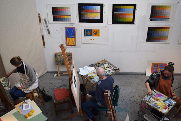
Colour Mixing Course is ideal for beginners and a very good refresher for the more advanced. The course will cover the necessary essentials needed for most visual art practices which concern colour such as, interior decorating and design , textiles, ceramics, printing and painting. You do not need representational drawing skills for this course. The course is purely about colour , how you mix it, how you observe it and how it changes and interacts in different surroundings and contexts. So you will experience the blending of colour, the discording and the harmonising of it . The course is highly recommended and popular. The fee includes all materials and use of tools and equipment.
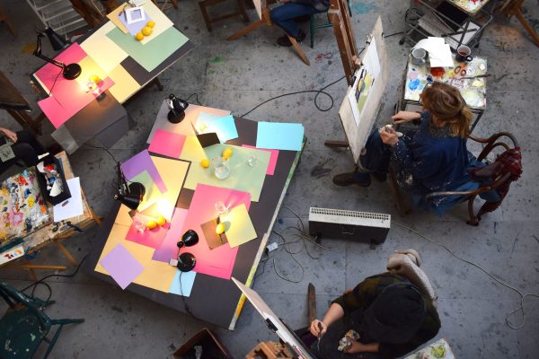
The course starts with a few tasks in colour mixing and matching. See below.
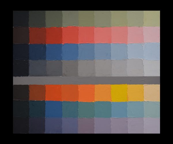
The colours used in this chart were made from the 3 primaries and white. (Black was made from mixing the 3 primaries)
The above chart is tonal, like a piano scale. By even notes you descend the scale from light to dark . The strip of grey in the middle is a complete visual illusion. The actual grey is in fact the same grey from left to right, ( but it appears to go from dark to light). This illusion is called ” Simultaneous Contrast”. Simultaneous Contrast is at the very heart of how you work colour against colour and adjacent.
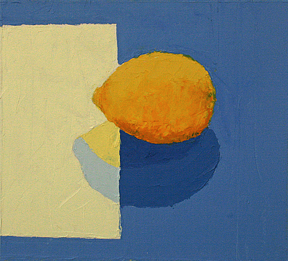
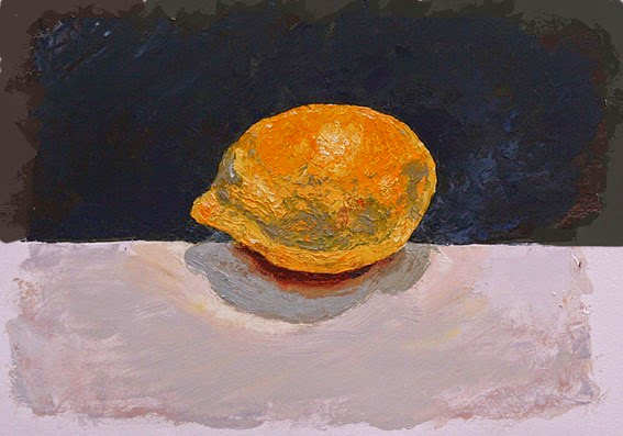
Two Lemons
After the above tasks in where you learn the fundamentals of colour mixing and tone , we then apply this knowledge to an actual object in front of you. Here are two examples of a lemon both with different background colours. The cast shadows and how the light falls across the lemon and coloured surfaces is the very crux of the matter. You are not only dealing with flat colour, but how surfaces reflect light and colour. To the naked eye it is not obvious that these two paintings we made by only using the 3 primaries and white. In many ways it is remarkable. In addition to this no brushes were used.The paint was applied with a palette knife and black was made by not using black.
Clare Rees ( using the 3 primaries and white)
Virginia Brown. ( using the 3 primaries and white)
Examples of Course work Visit this Gallery
.FEES and LUNCH
Our lunches are outsourced to an award winning chef called Gavin Kellett , who provides us with very wholesome and delicious vegetarian soups which are different on all days. If you have dietary requirements please let us know.The table is laid out pleasantly in our spacious dinning room. Lunch provides a very welcomed break. It is a friendly and relaxing time away from the working studio
Refreshments. Coffee ,teas and biscuits are freely available through out the day.
Some quotes :
“In visual perception a color is almost never seen as it really is – as it physically is. This fact makes color the most relative medium in art”. Josef Albers
.
“In order to change a color it is enough to change the colour of its background.” – Michel Eugene Chevreul
.
“Light is a thing that cannot be reproduced, but must be represented by something else – by colour.”–Paul Cezanne
.
“The chief function of colour should be to serve expression.” –Henri Matisse
.
“All colours arouse specific associative ideas…” –Yves Klein
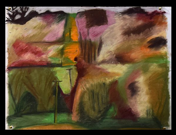
Landscape by Nick Weavers: Oil pastels. Using only Red , Yellow and Blue and white. No Black